Crafting an Ikon
Ikon Pass was born out of learning from our past product successes with the Rocky Mountain Super Pass and the MAX Pass. We developed the product to appeal to all skiers and developed the brand with an approachable fun tone. We knew we had to live in frameworks and responsive design but wanted it to feel fun but familiar.
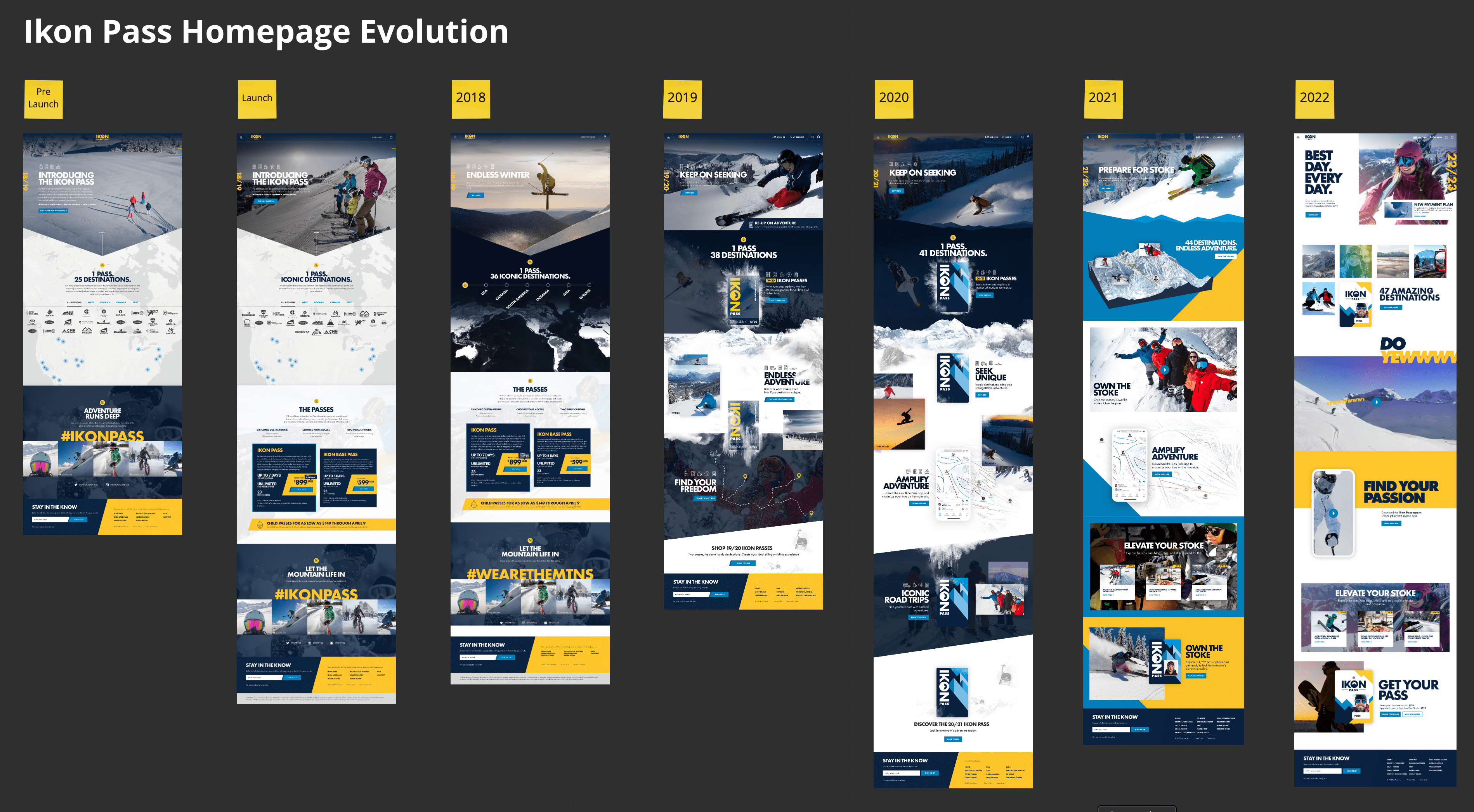
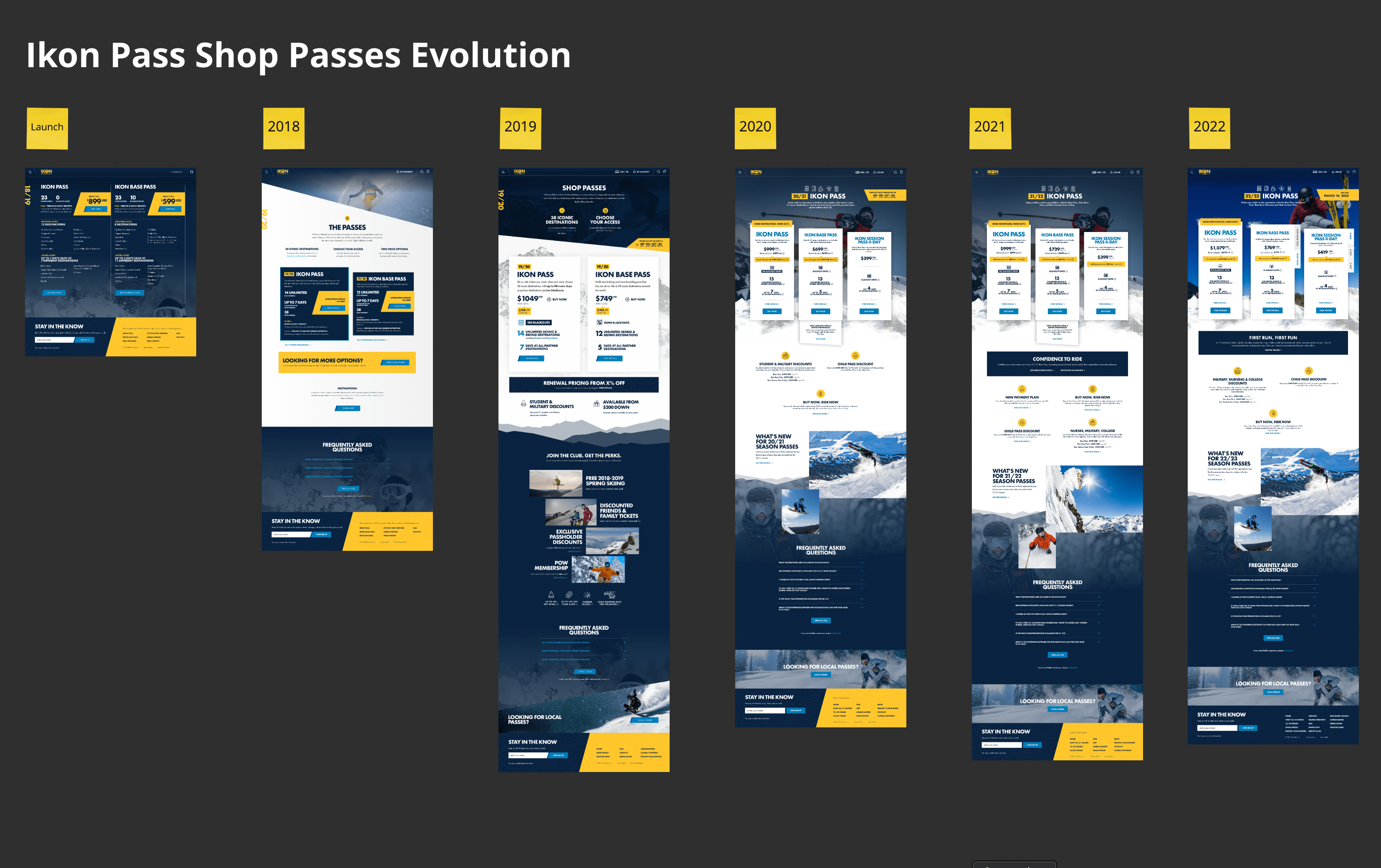
Each year as we update our overall marketing campaign we give the homepage a design refresh. Some years the goal was to promote our new app, others strictly the marketing campaign. As our portfolio of partner resorts grew we evolved the homepage to pivot away from strictly number of resorts, to the experience of our 50+ resorts.
As our brand matured so did our product matrix. From 2 core products we grew to 6. Some yield better for Ikon Pass than others and wanted to balance a unique brand design while clearly highlighted what we consider our “featured product”. In the design comps above you can really see that play out successfully with the Ikon Base Pass Plus. This product isn’t a huge seller but it does serve the need for a sub-section of the market. We didn’t want to bury it in deep site map, so we developed a clever visual design to strike the right balance of presence and obscurity so that we can focus on the happy path for most users.
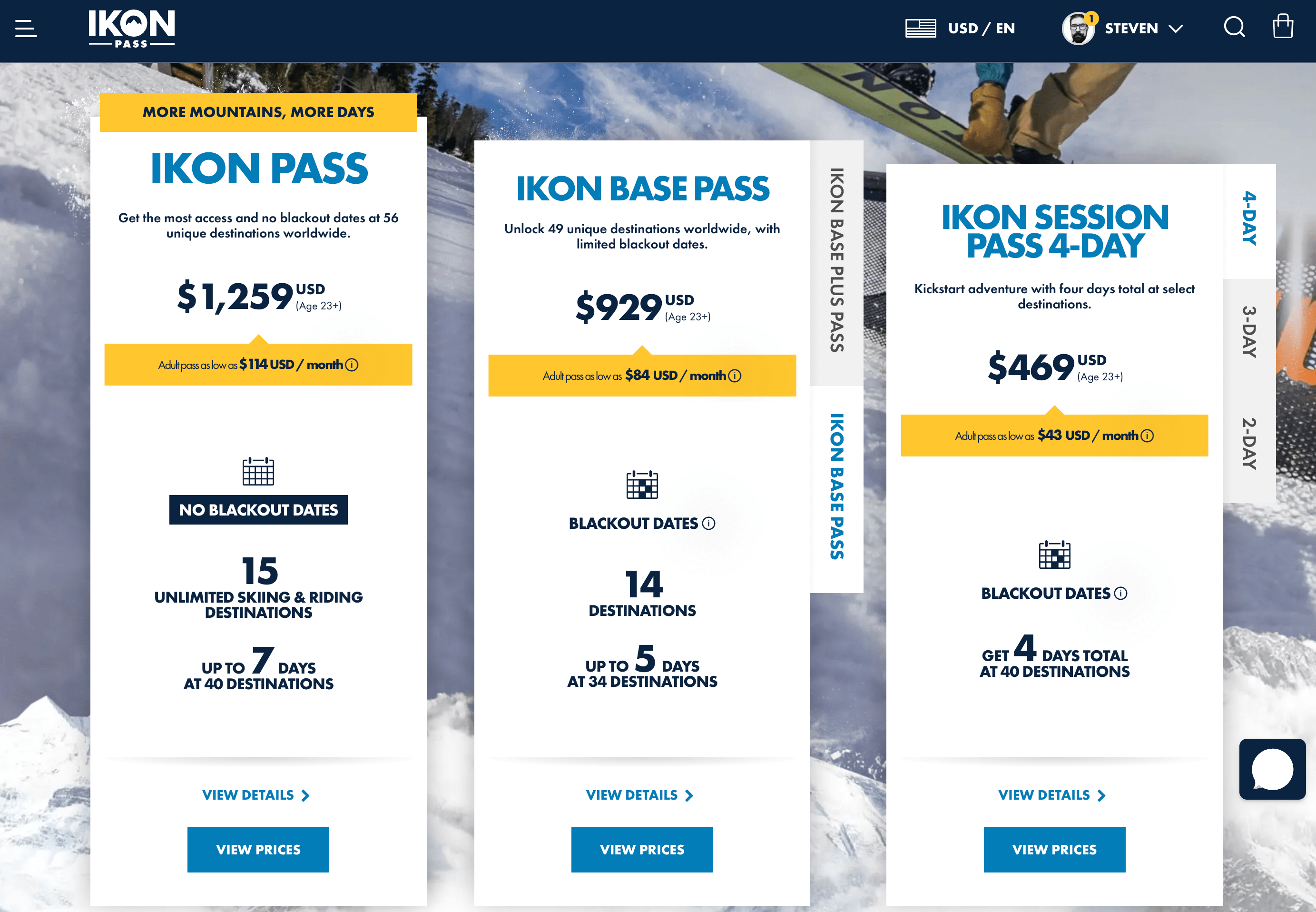
With the screenshot above you can see clear a few methods we use to merchandise the product.
- A visual hierarchy of products from tallest to shortest
- Clear left to right ordering
- A yellow feature ball to call out the top tier benefit
- Smart use of icons to support the lack of blackouts on the top tier product
Ikon Pass is a dynamic brand that continues to disrupt the ski industry. The disruptions spans the gamut of product setup, ux, design and benefits. I’m honored to have been able to shape this product from inception to it’s current state today.