Ski Colorado Ski Pass Redesign
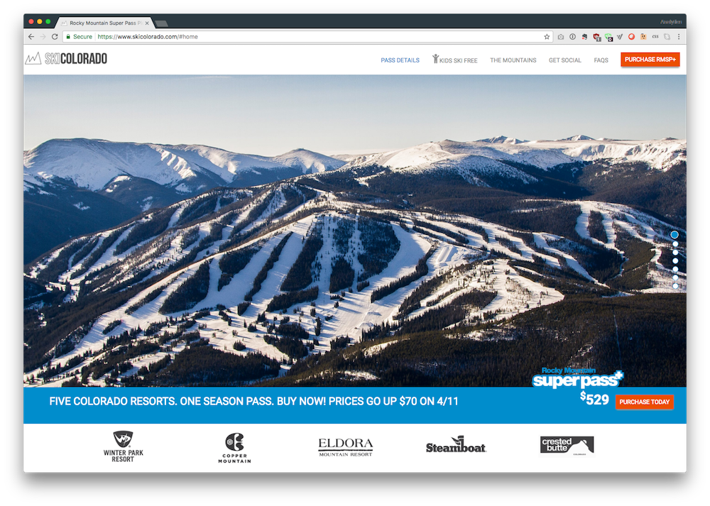
Ski Colorado was a multi-mountain product primarily aimed at the Colorado ski market driving hundreds of millions of dollars of revenue annually and the site was old and deperately in need of a redesign. One overarching goal was to simplify the site to feature our most important product, the Rocky Mountain Super Pass + (RSMP+). The old site ( view it here: Ski Colorado Archive ) was previously designed to sell products from our entire mountain pass portfolio, however, based on the analytics it was easy to see that the RSMP+ was the hero product and thus deserving of hero treatment.
With this initial direction we set out to design a flexible, responsive and fast website that would be an easy adjustment for longtime customers returning to renew their passes. We did this by clearly dedicating sections of the website in easy-to-understand chunks and providing a very concise FAQ that answers what we think are the questions customers are most likely to have, based on some excellent insight from our Guest Services team, up at Winter Park.
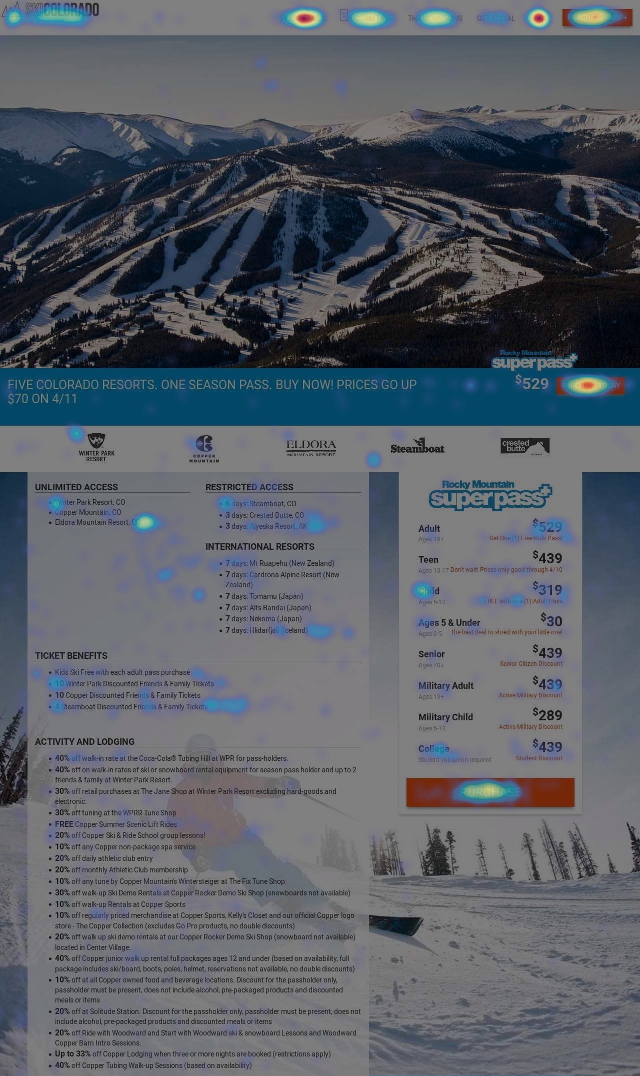
Based on initial heat mapping and NPS responses we think we are off to a good start, but will continue to monitor as the season gets further underway.
With site speed being the focus, we decided to go the static website route using Jekyll and hosting with Netlify a fantastic static site hosting service we use for a number of our websites, including the very rich and dynamic CMH.
The difference in raw performance using this approach is clearly illustrated by these Pingdom results:
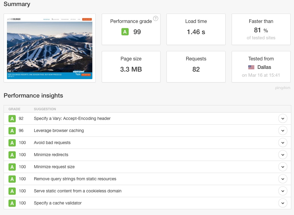
It’s important to bear in mind this is an “A” rating for a very image-heavy website with plenty of fancy javascript to handle virtual pages, and various other user actions. No small accomplishment.
Despite being a static website, we still needed a CMS to make timely updates to rates, FAQs, etc. In planning for this, we integrated a lightweight static CMS provider called Forestry. With Forestry anyone can easily add/edit text and images without the need for a developer. This has allowed the marketing team to be incredibly responsive to changes as they are needed.
With the new site also came increasingly detailed analytics data and the ability to A/B test and personalize copy/images/CTAs based on a huge number of different attributes, thanks to a much loved tool called Convert. We are able to message our Texas customers differently than our Colorado or New York customers, test CTAs, and/or colors. By integrating this tool we hope to improve our overall conversation rate just like we have done using the tool on TheMaxPass.com.
Lastly, and perhaps most importantly, this site was architected, designed, built, written and optimized completely in-house. We could have easily spent in the high five figures to have an agency learn about our brand, our requirements and our content only to design and build a site that doesn’t perform as well as this one will. I am incredibly proud of the team for pulling this off. What may seem like a simple site actually packs a lot of marketing intelligence and good design practices behind it while also performing extremely well for the end user. I hope we can continue the trend away from engaging outside web agencies for these smaller scale projects, instead using in-house teams that can bring expertise to aspects of our website development.
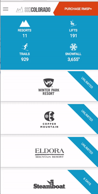
Sample of responsive content changes.